Google Sitelinks Come in How Many Flavors?
Google has long been known for having "10 blue links" and they have expanded far beyond that.
But even amongst the traditional listings there are lots of variations in how they are displayed.
Here is a regular result

with a second indented result
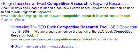
sometimes the second indented result can show inline sitelinks
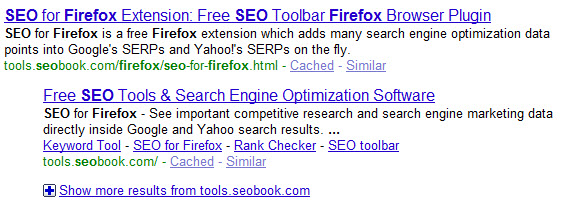
traditional single listing with 2 indented results under it (and then sometimes a non-indented 4th listing)
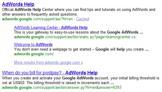
traditional single listing with 3 or 4 inline sitelinks

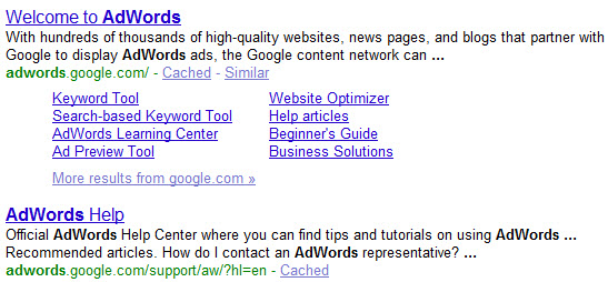
sometimes that has a second indented listing as well

traditional single listing with 8 sublinks below it (and this often has the second intented results below it too...though in such cases it is not indented)
traditional single listing with 4 links under it (often with dates near them) for forums & some blogs
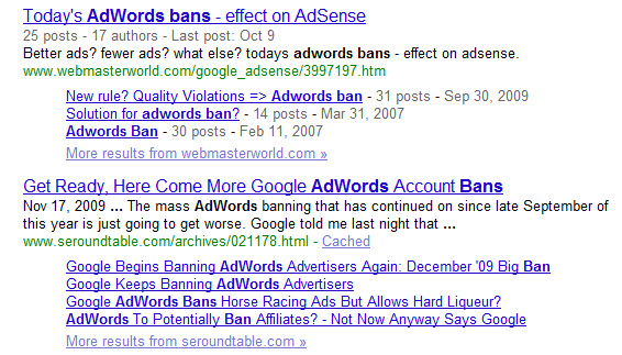
And the above does not take into account handling of domains vs subdomains (or http vs https), using breadcrumbs in the search results, insertion of additional data (like a picture of a video or reviews from micro-format data), other helpful links (like a link to the businesses location on Google Maps), and all the types of vertical search data (videos, music, movies, local, news, real time, shopping/product results) being pulled into the regular search results. And then you can layer personalization and localization on top of the search results as well as yet another layer of change. And don't forget about any user based metrics or temporal metrics Google might be able to add with caffeine.
When you think of all the different ways data can be modified and displayed it makes information architecture a bit challenging, especially for new projects when you don't know where you will be at in a year, how much the market will change in that next year, and how many additional formats Google will create between now and then.


Comments
Wow, my head spins.
There's yet another flavor. Do a Google search for my name, "Robert Tolmach". The second listing is my profile on LinkedIn. Unlike other listings, which typically have two lines of text, it has three. It starts with a line "Greater New York City Area - CEO, WellGood LLC" in grey text before the customary two lines of black text. How did they get that? We'd certainly love to know so we can get the best possible exposure for our nonprofit site, ClassWish.org. (While I have your attention, if you care about education, please take a look and help us out).
Keep writing!
Add new comment