New Local Carousel
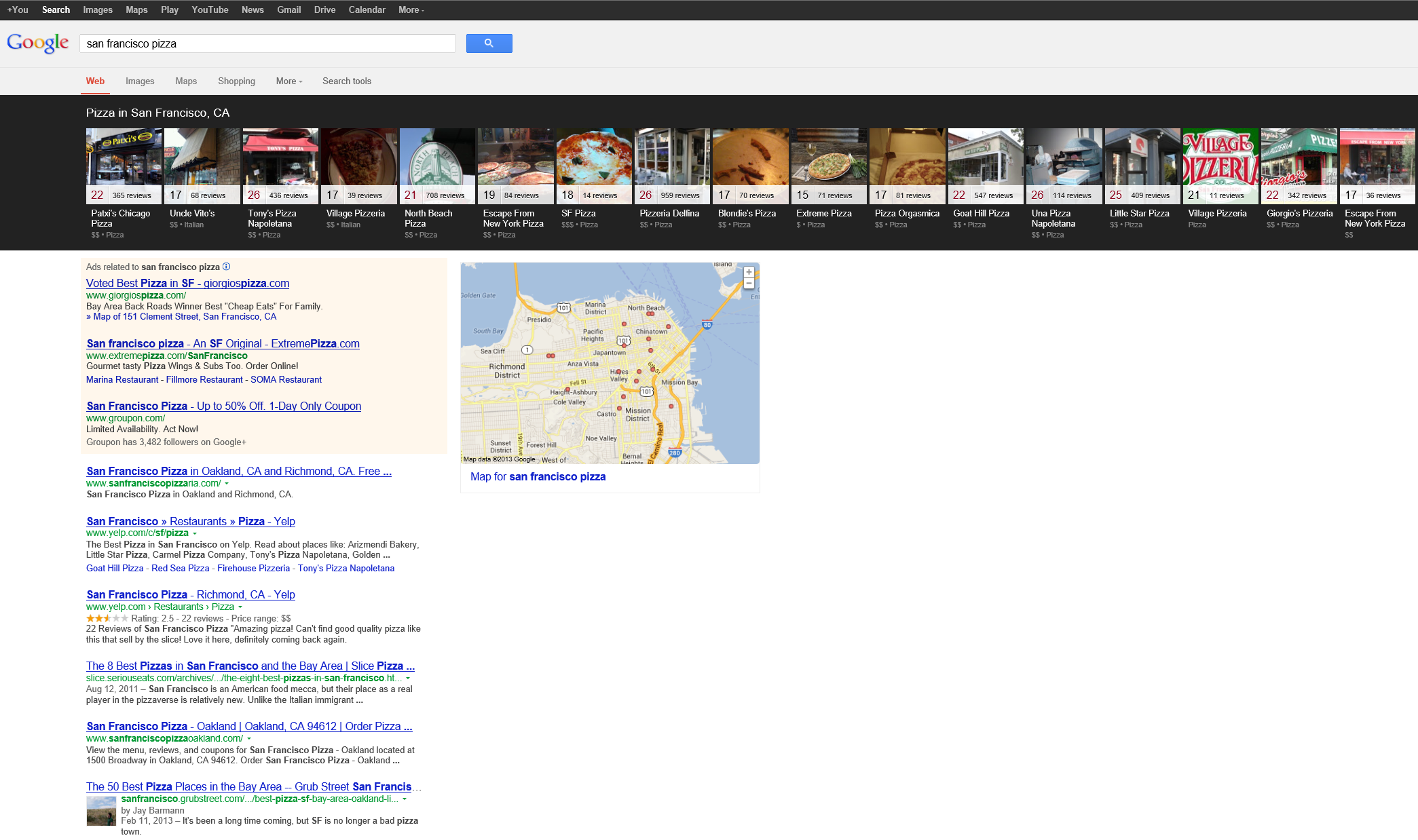
Google announced they rolled out their local carousel results on desktops in categories like hotels, dining & nightlife for US English search queries. The ranking factors driving local rank are aligned with the same ones that were driving the old 7 pack result set.
The layout seems to be triggered when there are 5 or more listings. One upside to the new layout is that clicks within the carousel might not fall off quite as quickly as they do with vertical listings, so if you don't rank #1 you might still get plenty of traffic.
The default amount of useful information offered by the new layout is less than the old layout provided, while requiring user interaction with the result set to get the information they want. You get a picture, but the only way the phone number is in the result set is if you click into that result set or conduct a branded query from the start.
If you search for a general query (say "Indian restaurants") and want the phone number of a specific restaurant, you will likely need to click on that restaurant's picture in order to shift the search to that restaurant's branded search result set to pull their phone number & other information into the page. In that way Google is able to better track user engagement & enhance personalization on local search. When people repeatedly click into the same paths from logged in Google user accounts then Google can put weight on the end user behavior.
This multi-click process not only gives Google usage data to refine rankings with, but it also will push advertisers into buying branded AdWords ads.
Where this new result set is a bit of a train wreck for navigational searches is when a brand is fairly generic & aligned with a location as part of the business name. For instance, in Oakland there is a place named San Francisco Pizza. Even if you do that branded search, you still get the carousel & there might also be three AdWords ads above the organic search results.
If that company isn't buying branded AdWords ads, they best hope that their customers have large monitors, don't use Google, or are better than the average searcher at distinguishing between AdWords & organic results.
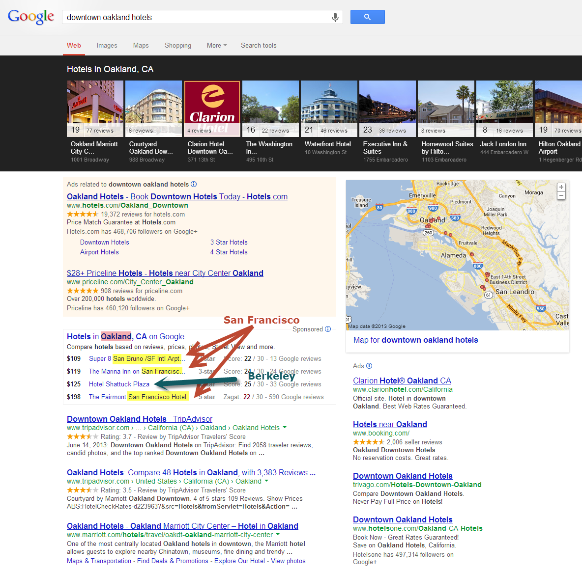
Some of Google's other verticals may appear above the organic result set too. When searching for downtown Oakland hotels they offer listings of hotels in San Francisco & Berkeley inside the hotel onebox.
Perhaps Google can patch together some new local ad units that work with the carousel to offer local businesses a flat-rate monthly ad product. A lot of advertisers would be interested in testing a subscription product that enabled them to highlight selected user reviews and include other options like ratings & coupons & advertiser control of the image. As the search result set becomes the destination some of Google's ad products can become much more like Yelp's.
In the short term the new layout is likely a boon for Yelp & some other local directory plays. Whatever segment of the search audience that dislike's the new carousel will likely be shunted into many of these other local directories.
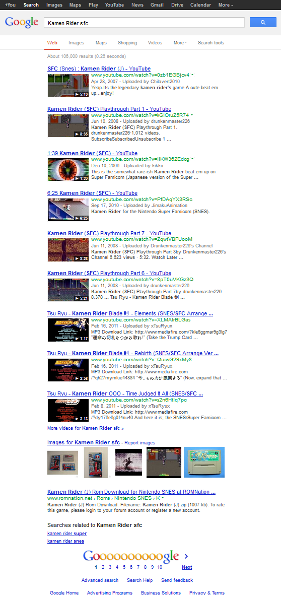
In the longrun some of these local directories will be the equivalent of MapQuest. As Google gains confidence they will make their listings richer & have more confidence in entirely displacing the result set. The following search isn't a local one, but is a good example of where we may be headed. Even though the search is set to "web" results (rather than "video" results) the first 9 listings are from YouTube.
Update: In addition to the alarming rise of further result displacement, the 2-step clickthrough process means that local businesses will lose even more keyword referral data, as many of the generic queries are replaced by their branded keywords in analytics data.


Comments
The carousel doesn't appear to only be local related. We're seeing it on a lot of searches that have nothing to do with local. For example, if you search [metallica albums] or [western novels], those should throw the carousel.
...they show it for a lot of search queries where it is easy for them to structure data on. It seems a number of the links from within the right rail knowledge graph activate this layout, like if you click on "people also searched for." While this layout has existed for a while, it was only recently that they launched this layout for local search queries on desktop computers.
It does seem a lot more widespread, including the addition of local. We weren't being served many of those for anything but within the past week they're showing up all over the place...and they do appear to be knowledge graph related. I may dig into some of the SERPs prior to the rollout that we have saved and see if there's any other pattern :)
Switching from vertical to horizontal is a very small change but it is fairer. The choice to the top link is very subjective. In fact, we know how 1 to 10 is quite meaningless. It is somewhat giving people back a degree of freedom. If you are looking for a restaurant in Manhattan, it does seem meaningless to sort a Chinese restaurant before an Italian one...
I am not incredibly happy about this feature. I feel that this will divert traffic away from the organic rankings, thereby lowering the value of organic SEO. I guess we will have to wait and see the full impact of this new feature.
Add new comment